


A candlestick chart represents the price movement of a stock over a certain time. This type of chart is quite popular among traders because they are easy to read and understand. Candlestick Chart & Analysis
A candlestick offers a wide range of information in a simple manner. Each candlestick is composed of a body and wicks (thin lines extending above and below the body).
A typical candlestick looks like this:
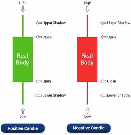
A candlestick chart includes the open, close, high, and low price of a stock over a specific time frame. This time frame can be fixed by the trader as per his requirement.
For example, if the time limit is fixed at ten minutes, then a new candlestick is created in the graph after every ten minutes. Candlestick Chart & Analysis
Then, by simply looking at the chart, the trader can find out all the four major price movements of the stock over a particular time frame.
It is important that candlesticks should not be observed in isolation. The context (past patterns) is very crucial when it comes to candlestick analysis. The trader must observe the previous candlesticks and observe how they have changed over time.
Has the body of the candlestick become larger or smaller? What about the wicks (shadows)? How have they changed?
These are the questions the trader must ask himself as he analyses the candlestick chart.
This is because when the real body of the candlestick becomes larger, it indicates an increase in momentum.
The body of the candle shows how much the price of the stock has changed over the duration of the time frame. A long white candlestick represents bullish strength while a long black candlestick represents bearish strength in the market.
If you want to know more about Risk Management & Intraday Trading Strategies you can refer to our previous blog on
Importance Of Risk Management In Trading and 10 Best Intraday Trading Strategies.
Open a Demat Account using our link to get support from us – https://bit.ly/3gyhIWN and send your ID to [email protected]
Happy Learning!

Awesome