

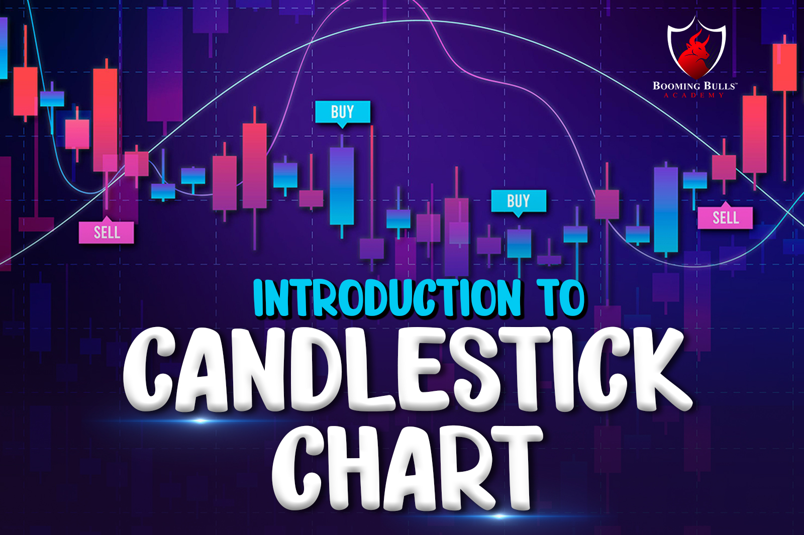
Every trader, whether a beginner in the field or an experienced one, has heard of and interacted with a candlestick chart. Developed by Munehisa Homma, a rice trader in 18th Century Japan, this chart is one of the most effective and basic price charts used in the stock market for technical analysis.
Used by traders to determine when to enter or exit the market, a candlestick chart shows a security’s high and low for a specific time period. It is a crucial component of technical analysis.
A candlestick has three parts –
The main body of a candlestick specifies whether the closing price was higher or lower than the opening price (black/red in case of lower, and white/green in case of higher), and the shape of the candlestick’s shadow represents the fluctuation in price of the security throughout the day, from opening to closing time.
In a candlestick chart, white/green candlesticks indicate that there is a strong buying pressure, or in other words that the price is bullish. A black/red candlestick on the candlestick chart points towards a significant selling pressure, which indicates that the price is bearish.
As mentioned earlier, a candlestick shows the price movement for a specific time period. This time period can be anything from ten minutes to a few hours, according to the trader’s wishes.
Traders need to keep in mind though, that a candlestick chart should be looked at in the context of the overall market structure, since any number of factors can affect the securities and their respective price. This makes a candlestick chart one of the best factors for risk management.
There are several candlestick chart patterns which you will come across in your study of technical analysis and fundamental analysis, or when you start creating your own trading strategy. Here we list out a few common ones for your knowledge.
The Hammer Pattern – This is a reversal pattern. A hammer contains a small body and a long lower shadow and occurs at the bottom of the trend. Almost no upper shadow in the hammer pattern exists.
Hanging Man – Hanging man is a single candlestick pattern that occurs at the top of the uptrend. A candlestick pattern is considered as a hanging man only if it precedes an uptrend. The bearish hanging man indicates selling pressure on high levels.
Bullish Engulfing Pattern – A double candlestick pattern which indicates trend reversal in the buyers’ favour, a bullish engulfing pattern is a candlestick pattern which forms when a red candlestick is followed and overtaken by a large green candlestick.
Bearish Engulfing Pattern – A double candlestick pattern which indicates a trend reversal in the sellers’ favour, a bearish engulfing pattern is a candlestick pattern which forms when a green candlestick is followed and overtaken by a large red candlestick.
Doji Pattern – The Doji pattern takes the form of a plus sign. The open price is almost equal to the closing price with only a slight difference between the two. This is indicative of indecision in the stock market.
We hope that through this article, our readers would have gained a basic understanding of a candlestick chart and the most commonly used candlestick patterns, which will aid the start of your journey as a trader in the Indian stock market. If you wish to learn more about the stock market, trading strategies, risk management, etc., in greater detail, you will find the relevant articles on the Booming Bulls Academy blog.
Open a Demat Account using our link to get support from us – https://bit.ly/3gyhIWN and send your ID to [email protected]
Happy learning!